In September 2021, I put up a post on the geography of carfree (or car-free) households in the United States during the 2015/2019 period. It drew more traffic than any other post on this site.
The data presented on that post were generated for the five years before the Pandemic. During the Pandemic, several newspaper stories suggested that numerous previously carfree households had acquired an automobile or planned to do so,1 and some academic studies argued that this in fact may have happened to a limited extent.2
The Census Bureau released American Community Survey data for the 2019/2023 period at the end of 2024. The years covered included the height of the Pandemic. There was a one-year overlap with the 2015/2019 data, although the numbers had to be recompiled since the 2015/2019 data were generated for 2010 census tracts, while the 2019/2023 data were collected for 2020 census tracts.
These data suggest that there was indeed a small decline in the proportion of carfree households during the years of the Pandemic. In the 2015/2019 period, 10,583,011 out of 121,906,312 households (8.68%) were carfree. In the 2019/2023 period, only 10,768,298 out of 128,702,462 (8.36%) households were carfree.3
The (small) decline in the proportion of carfree households may have been larger for those tracts where carfree households were scarcer. Note the following table that shows the number of tracts in each of the size categories identified on the maps below.

It looks as though the bulk of the many tracts added to the database (which were largely the result of tract splits in the fast-growing edges of urban areas) had few carfree households. But most of the tracts with a large proportion of carfree households stayed relatively carfree.
As in the earlier period, the overwhelming majority of extraordinarily carfree tracts were in large cities, and most of these were in New York. If we exclude 20 tracts with fewer than 60 households, there were 399 tracts in which 75% or more of households were carfree. 374 of these were in New York, 10 in San Francisco, 4 in nearly roadless parts of Alaska, and 3 each in Philadelphia and Baltimore.
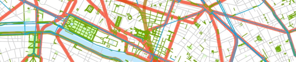
Anyone with a knowledge of American cities could see after a glance at the maps below that there is clearly a close relationship between residential density and carfree status. There is also some relationship between carfree status and the long-established availability of good rail transit, which, of course, is also highly correlated with population density.
For the larger and denser cities, there is little correlation between carfree status and income. In New York City, there is actually a positive (although not very significant) correlation (+.158) at the tract level between carfree status and per capita income. Some of the most carfree neighborhoods—Greenwich Village and the Upper East and West Sides, for example—are quite well-off these days. In several other of America’s larger and denser cities, there is also only a modest correlation between carfree status and income, although this is complicated by the fact that tracts in the American Community Survey are identified by county, not municipality. Some figures: Cook County (i.e., Chicago) -.043, Suffolk County, Mass. (i.e., Boston) -.137, and Washington, D.C. +.115. Well-off places like Chicago’s North Side Lakefront, Boston’s Back Bay, and Washington’s Georgetown are by American standards pretty carfree but not to the extent that, say, the Upper West Side of Manhattan is, and poorer neighborhoods in these cities generally have levels of car ownership not much different than in similarly dense well-off neighborhoods. There are also well-off but smaller and only moderately carfree areas in San Francisco, Portland, and Seattle (correlations between carfree status and income were -.178, +.053, and +.038 respectively). Philadelphia’s well-off Center City is as carfree as anywhere outside of New York, but Philadelphia has so many much poorer carfree areas that the correlation between per capita income and carfree status at the tract level is -.514.4 Relatively carfree areas in other cities also tend to be poorer, and the correlations between carfree status and per capita income are also typically quite negative (examples: Los Angeles County -.263 and Saint Louis City -.598). but there are some exceptional neighborhoods even in these cities, for example, part of Santa Monica in Los Angeles, the Central West End in Saint Louis, as well as South Beach in Miami Beach and (not shown on a map in this post) Waikiki in Honolulu.
These maps don’t look very different from the maps for the earlier period, but there are a few minor changes here and there as well as some cartographic differences. Note the following:
[1] All the maps have a nominal scale of 1:200,000, a little more than three miles to the inch. That’s the scale the maps would have if printed on 11-x-11-inch sheets of paper.
[2] All the maps use the same class intervals and colors as on the New York map. And I’ve employed purple for light rail lines rather than the pink I used on the earlier set of maps.
[3] The maps include urban rail lines, divided into two categories: “Subways, etc.” and “Light rail, etc.” The distinction between these two categories is a little arbitrary. Most subway lines use “heavy rail” rolling stock and are completely grade-separated, but a few Chicago lines have level grade crossings, and I’ve included the JFK AirTrain in the “Subways, etc.” category, since it’s so substantial and so clearly tied to New York’s subway. “Light rail, etc.” includes not only light-rail lines but also streetcars, cable cars, and certain airport people movers. Many light-rail lines in the United States are partly (and in one case completely) grade-separated, but I believe they all use light-rail (rather than heavy-rail) rolling stock. None of the maps includes the (generally suburban) rail lines that chiefly run on traditional mainline railroads. A few of these lines in New York and Chicago may have affected car ownership to a limited extent. Note, for example, all the somewhat carfree neighborhoods on the extreme South Side of Chicago, where the electrified Illinois Central (now Metra Electric) used to provide frequent subway-style service (a contributing factor to the low levels of car ownership in these neighborhoods is that they’re all quite poor).
[4] Crosshatching shows census tracts where no data were reported for 2019/2023. These tracts all have few residents. They consist mostly of either airports or industrial zones. A few large parks and cemeteries are included too.
Here are the maps:


It would seem like a no-brainer to compile a map showing the change in the tract-level extent of automobile ownership between 2015/2019 and 2019/2023, but this is not as easily done as one might imagine. There were numerous census-tract boundary changes, and, while there are standard ways to redistribute data to accommodate this, they tend to lead to geographical distortions. The chief problem, however, is that American Community Survey data are all estimates, based on a rather small sample at the tract level. For most tracts (where carlessness is rare), the margins of error in the count of vehicle-free households are larger than the estimates of the number of households where no vehicle is present. While I believe that the Census Bureau does some data-cleanup to make sure that no clearly improbable figures appear, the survey-to-survey changes where small numbers are concerned are not very meaningful. I did generate the two maps below for the central New York area. These maps show the change in the number and proportion of carfree households between 2015/2019 and 2019/2023. These maps should be more reliable than comparable maps for anywhere else in the country since the figures are generally larger. I dealt with the boundary-change problem by moving data for 2019/2023 to 2015/2019 tract boundaries on the basis of which tract the centerpoint of the later tracts fell into.5 This should work fine when (as is usually the case) tracts were simply split between the two survey periods. Some cleanup would be necessary for more complicated border changes, of which there were hardly any in the area shown on the map. Thus, the map reflects the data pretty accurately. The important thing is that there aren’t obvious geographical patterns in the maps. Perhaps there was a bit more of an increase in car ownership in the Bronx than anywhere else in New York City, but the difference is not dramatic. I’m pretty sure that most of what look like substantial changes in the number of carfree households are the result of population changes and the inevitable imperfections in the data.6 Note on the second map that the proportion of households that were carfree did not change much in most tracts.

Change in the number of carfree households by census tract, New York and vicinity, 2015/2019-2019/2023.

Change in the proportion of carfree households by census tract, New York and vicinity, 2015/2019-2019/2023.
The most important lesson here may be that there really are a few urban neighborhoods in the United States that, to one degree or another, have resisted becoming car-centric and that these areas are holding their own despite the Pandemic. Some of these areas have low levels of vehicle ownership because of poverty, but others are quite prosperous. A few of these neighborhoods, in fact, are among the most expensive places to live in North America. But these areas are relatively small islands in a country of car-dependent places.
- For example: Foster Kamer, “The great Gotham vroom boom of 2020,“ New York Times (12 August 2020).
- See, for example: Piyushimita (Vonu) Thakuriah, “Exploring car-ownership and declining carlessness in the United States during the COVID-19 Pandemic,” Transport Findings (28 March 2023).
- The formula used to determine the proportion of carownership: (ASUTE003 + ASUTE010) / ASUTE001 * 100. I downloaded the data from NHGIS IPUMS. The non-Census-related GIS data come mostly from the Geofabrik version of OpenStreetMap.
- Manhattan by itself is in a similar situation. Relatively poor neighborhoods like Harlem, East Harlem, and the Lower East Side have even lower levels of car ownership than, say, the Upper West Side, and the correlation at the tract level between carfree status and per capita income is -.341.
- While making sure that the centerpoint lay within the tract boundary.
- Note that the dots on this map are located randomly within census tracts. Tracts for which there was no American Community Survey data in one or both years are left blank.
These maps are terrific–I spent hours looking at them.