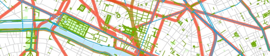
Here are four census-tract-level maps showing the “modal split” of journeys to work by workers 16 and over during the 2015/2019 period in the central parts of the New York, Chicago, Los Angeles, and San Francisco areas. All these maps use the same symbols, have a nominal scale of 1:100,000, and, if printed at 300 dpi, would occupy the same percentage of a 17 x 17 inch sheet of paper. (They will appear on a smaller scale on most computer screens unless you zoom in.) The maps use pie charts placed at tract center points to show modal split.
These maps are based on data from the U.S. Census Bureau’s American Community Survey (ACS).1 The results of this survey for larger areas are probably quite reliable, but, at the census-tract level, the margins of error can be substantial, especially for smaller numbers. The narrower slivers on the pie charts, in other words, are less likely to be accurate than the thicker slivers. For most places, this means that the data on journeys to work by bicycle are less reliable than the data on journeys to work by car or (depending on the area) transit.
The numbers used to make the maps come from answers to the census question: “How did this person usually get to work last week?” Respondents were not allowed to check more than one box. It’s not clear how someone who biked to work on Monday, walked on Tuesday, took a bus on Wednesday, carpooled on Thursday, and drove him- or herself on Friday would have been most likely to answer the question.2 Hopefully, things balance out. There really is no other national data set at the tract level that gives any kind of consistent information on choice of travel mode. And I don’t know of any national data at all on non-work trips.
Census tracts (for those unfamiliar with the term) are small, supposedly homogeneous areas devised by the Census Bureau. Certain large cities were first divided into census tracts early in the 20th century, and the entire country was “tracted” in 2000. The United States is now divided into nearly 74,000 census tracts. The average census tract has a population of something like 4,500, but in fact, if only because tract boundaries are changed reluctantly, census-tract population varies enormously, from zero to many tens of thousands in a few cases. For the 2015/2019 ACS, the middle 80% of the tracts varied in population from 2041 up to 7344. This seems like a big range, but it’s still possible to say that census tracts almost all have populations on the same order of magnitude. They most definitely do not, however, occupy the same amount of physical space. Census tracts in the denser regions of cities (for example, in much of Manhattan) are tiny; those in parts of Alaska are bigger than some states. The proximity of the pie charts on the maps below is a rough indicator of population density. There is a substantial cartographic problem here. The Lower East Side and the central Bronx, for example, end up being so crowded that it’s hard to tell what’s going on, while the San Gabriel Mountains and Berkeley Hills, at the other extreme, are so empty that it seems as though valuable map space is being wasted. The New York map, in other words, would be easier to read if the nominal scale had been something like 1:75,000; the other maps would mostly have looked better with nominal scales of approximately 1:150,000. Another problem I faced was choosing what to include. I went back and forth an embarrassing number of times trying to decide whether to include tract boundaries. The problem is that they disappear completely in much of the New York map, while they’re all too visible in the least populated areas.
The maps are clickable and downloadable, but the files are large, so that redrawing the maps can take a little while. Zooming in makes many of the details clearer; it also reveals minor faults in the data.
The message of the maps is the unsurprising one that large parts of New York and much smaller areas in Chicago and San Francisco have fundamentally different travel habits than does most of the rest of the United States. Transit use and walking are common modes for the journey to work, and automobile use is rare. This is true at all income levels.3
Another message of the maps is that walking is a more frequent way of getting to work than many would think. It’s most common around central business districts (even in Los Angeles) and near major residential universities, like Columbia, the University of Chicago, UC Berkeley, and even UCLA and USC. Bicycling to work occurs on a large scale around certain big universities too.
The maps also demonstrate that Los Angeles, despite its enormous investment in rail transit, remains quite different in its travel habits from large parts of New York, Chicago, and San Francisco. Except in the dense, socially complicated but (on the whole) relatively impoverished neighborhoods west of downtown, transit users in most of Los Angeles are uncommon, even along rail lines. Because the Los Angeles area has such a large number of people, the total number of transit riders is substantial, but they are a minority in most places. The same thing, of course, is true in suburban areas in New York, Chicago, and San Francisco, although suburban rail lines in all these cities do attract quite a number of users. I acknowledge that none of this will surprise anyone.
The 2015/2019 ACS is the latest to be released by the Census Bureau, but it already feels like historical data. Because of the Pandemic, many people have been working at home, at least part of the time, and transit use remains depressed everywhere. Bicycling advocates claim that there has been a huge rise in urban cycling and cite some scattered data to support their belief. They may be right, but an increase from, say, 2% to 4% doesn’t change the big picture very much.
No one knows whether the changes that have occurred during the Pandemic will last. We will have to wait until something like 2026 for the Census Bureau to produce ACS data for the Pandemic and post-Pandemic period.


- Downloaded from the NHGIS-IPUMS website.
- The various transit choices—subway, bus, etc.—have been consolidated, as have the various choices under “car, truck, or van” (which mostly involve whether or not the respondent drove alone or carpooled). Journeys to work by motorcycle, taxicab, and “other means” are ignored, as is the response “worked from home.”
- For New York, there is a (non-significant) positive correlation at the tract level of .042 between per capita income and percent of workers 16 and over who took public transit to work. Density seems to be the determining factor. There is a (highly significant) positive correlation at the tract level of .608 between population density and percent of workers 16 and over who took public transit to work.