I spent a few days in Abu Dhabi in early March. I had been there once before, but only for a couple of hours on a very hot day in 2010. This was my first extended stay in the city. I was particularly interested in looking at Abu Dhabi’s pedestrian facilities.
It’s impossible to consider or understand Abu Dhabi without comparing it to the United Arab Republic’s other major city, Dubai. Dubai is much larger. It has perhaps three and half million people, but the Dubai urban area, which includes adjoining Sharjah and Ajman, has a population of something like five and half million. It contains more than half the population of the UAE. Dubai, in other words, has become by any standards a very large place, a key component of the world urban hierarchy. Abu Dhabi is a substantial city too, but it is considerably smaller than Dubai. An urban-area population figure of 1.8 million is sometimes given.1
Dubai has a probably well-deserved reputation for being by far the bolder and more innovative city. After all, it has the world’s tallest building, largest shopping mall, and longest indoor ski slope. For quite a number of years it had the world’s longest driverless metro, and it’s in the process of constructing the world’s largest airport. Abu Dhabi can’t claim any of these distinctions, and, in fact it has not been nearly as good as Dubai at following through on its more ambitious plans. Plans to build a metro, along with a branch of the Guggenheim Museum, an ecologically sound settlement in Masdar City and, in general, much of what was aimed for in the Abu Dhabi 2030 master plan, have been put on hold.
There is another difference between Dubai and Abu Dhabi. Dubai is considered in the context of the Arab world a socially pretty liberal place. It’s not hard for non-Muslims to buy alcohol or pork; and it’s more or less okay to wear mildly immodest clothing. Abu Dhabi isn’t Riyadh, but it prefers to keep activities that are considered un-Muslim by religious conservatives pretty much invisible. It is definitely the more conservative city.
Curiously, however, Dubai has more well-preserved older neighborhoods than Abu Dhabi. Districts like Deira and Bur Dubai have few genuinely old buildings but function in many ways like traditional Muslim cities. Abu Dhabi, in contrast, completely obliterated the pre-1960s settlement after the oil started flowing.
In the broad scheme of things, the two cities have much in common. Both are very car-oriented and have numerous huge skyscrapers. Both are wonderfully multi-ethnic places in which foreigners outnumber Emiratis by something like ten to one. The foreigners come from all over, but include particularly large numbers of people from southern India, Pakistan, the Philippines, and the poorer Arab countries. Foreigners include well-paid professionals (among whom there are many westerners), clerical and service workers earning modest salaries, and badly exploited manual laborers. Solid data are unavailable, but it’s pretty certain that the level of inequality in both Dubai and Abu Dhabi is as high as it is anywhere.
I was struck when I was in Dubai last December at all the efforts that have been made in the last few years to mitigate two or three decades of car-centric development (see my earlier post). Dubai hasn’t exactly become a pedestrian paradise, but it now has good public transit; drivers almost always yield to pedestrians at crosswalks; and there are now numerous facilities aimed at pedestrians and cyclists.
Abu Dhabi has been moving in a similar direction but generally on a much smaller scale. It’s never built the long-planned metro, but it has quite an elaborate bus system.2 And it too has some facilities for pedestrians and cyclists and is planning more, although the geography of pedestrian life in Abu Dhabi is quite different from that in Dubai.

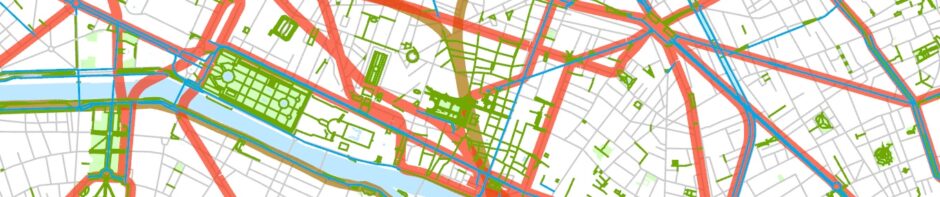
Central Abu Dhabi, with facilities for pedestrians and cyclists emphasized. These include both major paths like the Corniche along the top of the built-up area and some short bridges and tunnels and (in a few cases) purpose-built sidewalks. GIS data come from the Geofabrik version of OpenStreetMap, somewhat modified.

Broader view of Abu Dhabi. Some of the settlements on the city’s edge are earmarked for construction workers. GIS data again come from the Geofabrik version of OpenStreetMap, somewhat modified.
Abu Dhabi’s central business district (Markaziya), for example, is quite different from any of Dubai’s centers. Actually, it’s been constructed to accommodate pedestrians perhaps a little more smoothly than any of Dubai’s newer developments, which, despite the size of their buildings, are very car-oriented. Central Abu Dhabi, laid out in 1968 by an Egyptian city planner, Abdul Rahman Makhlouf,3 seems in some ways startlingly North American. The wide streets are arranged in a grid. There are sidewalks almost everywhere. Tall buildings—a mix of office and apartment towers—line the major streets. Most have shops on the ground floor. The chief oddity of the arrangement is that the blocks are huge, averaging something like 500 x 500 m. Also, separate right turn lanes are often carved into the sidewalk. Because many buildings rise to about the same height on some streets, central Abu Dhabi can vaguely resemble parts of downtown Washington or Ottawa, where height limits created the uniform landscape (but Abu Dhabi’s buildings are taller, and housing and retailing are more important land-use components there).

Zayed the First Road, Abu Dhabi. Note the uniform heights of most of the buildings and the parking in the lower bottom that interrupts the sidewalks available along most of the street.
Within the Abu Dhabi CBD’s huge blocks, there is a great deal of variety. Often, the block centers include surface and low-rise parking facilities. Typically, there are also other low buildings, between which are winding pedestrian paths and drivable streets.
There is a surprisingly healthy pedestrian life along the arterials in Abu Dhabi’s CBD. There are people walking on the streets until late at night. There are also some open spaces that have become informal meeting places.4
Crossing streets—which can be extremely difficult and even dangerous in much of the Arab world—is easy as long as you’re willing to walk to a corner with a traffic light and then wait for the light to change. It’s quite common to have a wait for a couple of minutes in the middle of a busy road.

Waiting to cross Zayed the First Road.
There are also several dozen underpasses that will take you across main roads. These never, however, have escalators or elevators. Jaywalking, subject to a large fine, is practically non-existent.

Pedestrian tunnel under Zayed the First Road.
Pedestrians do have to watch out for changing sidewalk levels, and in front of some buildings sidewalks have been partially replaced by surface parking. There is no doubt that even in the CBD the expectation is that most movement will be by motor vehicle, but it really isn’t that hard to do without. In central Abu Dhabi at least, I saw nothing as hostile to pedestrians as Sheikh Zayed Road in Dubai.
Away from Abu Dhabi’s CBD, there are many fewer pedestrians, but it does seem as though sidewalks exist in most places, at least on Abu Dhabi Island. They become scarce in more remote suburbs, and the new tall office and apartment buildings that have been built in several outlying areas are not easily reachable on foot, although, as in Dubai, many new developments do have pedestrian paths and advertise their walkability (example here). They wouldn’t do this if there weren’t some demand for walkable space.
Abu Dhabi, like Dubai, also has some specially built pedestrian facilities, most of which are clearly aimed at recreational users. The most outstanding example is the Corniche, which runs nearly the whole length of the northwest side of Abu Dhabi Island, a distance of about 8 km, with some branches around the breakwater and toward the Emirates Palace Hotel at its southwestern end. There are also many supplementary paths in the adjoining parks.

Abu Dhabi’s Corniche.
The Corniche actually goes back several decades, but it’s been moved northwest and improved as part of a landfill project that created both a through road and a considerable amount of parkland along Abu Dhabi’s edge. Unfortunately, the parallel road is never far from the pedestrian path, especially along the Corniche’s southwestern two or three kilometers.
The Corniche is well-used, especially in the early morning and the late afternoon and early evening. Most users are either walking pedestrians or people sitting around and socializing. There are also some runners and cyclists, the latter of whom are supposed to use a separate bicycle path that runs nearly the entire length of the Corniche but don’t always. Users appear to come from all of Abu Dhabi’s many ethnicities.

The bicycle path that runs along nearly the entire Corniche. Photo also shows the pedestrian path (right) and Corniche Road (left).
The Corniche adjoins the Markaziya, and its southwestern end is right next to a very impressive cluster of skyscrapers that form a subsidiary business district. Users of the Corniche thus have a wonderful view of Abu Dhabi’s skyscrapers. In Dubai, in contrast, the beach paths generally adjoin medium- or low-rise residential neighborhoods, so the urban views aren’t nearly as striking.
There are shorter pedestrian facilities elsewhere in Abu Dhabi, for example the Eastern Mangroves Corniche opposite Mangrove National Park in southeast Dubai and a (brand new) path on the western the of Al Maryah Island, where another subsidiary high-rise business and residential district is being developed (among other things it contains a branch of the Cleveland Clinic).

New recreational path on Al Maryah Island, which, for the moment, seems to be attracting only a few users.
There are also some pedestrian facilities on Al Saadiyat Island, part of which is becoming a cultural district. The first branch of the Louvre outside Paris—one of the elements in Abu Dhabi’s most ambitious plans that has actually opened—is located here. One problem, however, with the Saadiyat Island complex is that it’s not possible to walk or bicycle there, at least from central Abu Dhabi. You need to take a limited-access highway, which has no space for anything but motor traffic.
There are plans to increase the number of pedestrian facilities, even in the outer city.5
The United Arab Emirates of course has an economy in which the extraction of oil is the most important activity, and most of the UAE’s oil is located in the Abu Dhabi emirate.6 Abu Dhabi could have aimed to become a city in which nearly all travel was by automobile. The fact that it has chosen to put at least some of its resources into creating pedestrian facilities appears to reflect the sophisticated understanding of its decision makers that complete automobile dependence creates an aesthetically disagreeable place with limited recreational opportunities. It would be nice to think that they’ve also realized that a completely car-centric city is one where the carless have serious mobility problems.


